
Happy Birthday, Stanley Park!
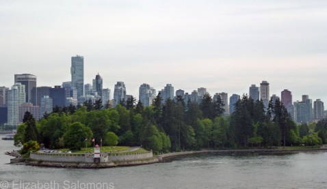
Stanley Park turns 125 today. The city threw a big party in the park last August to celebrate the occasion, but its actual birthday is today, as it was on September 27, 1888, that the park was first officially opened to the public.
At 1000 acres, Stanley Park is the largest of Vancouver’s parks, and also its most popular. It contains an estimated 500,000 fir, hemlock, and cedar trees, and has three beaches, a lake, a lagoon, an 8.8-km seawall, and many more kilometres of walking trails that meander through its interior.
It’s named after Lord Stanley of Preston, Governor General of Canada from 1888 to 1893.
University of British Columbia
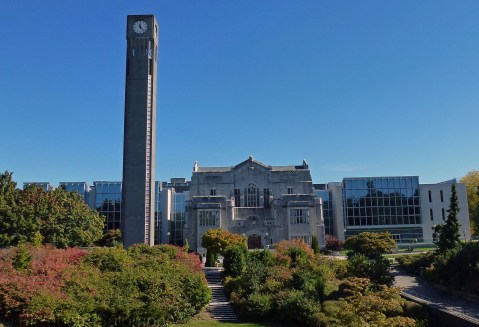
The last school I want to show you on my tour of schools I’ve photographed is the University of British Columbia. Like Simon Fraser University, UBC is situated a ways away from the hustle and bustle of the city centre ― its main campus is located at the western tip of Point Grey, a peninsula to the west of Vancouver’s toniest neighbourhoods.
UBC is a hodge-podge of architectural styles. For one, it’s got your neo-Gothic. This is the Chemistry Building, one of the first three buildings constructed on the Point Grey campus. That was back in 1925.

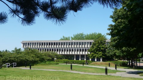
For another, it’s got your Brutalism. The Buchanan Tower was built in 1972.

And it’s got your postmodernism. This is the Koerner Library, which was designed by Arthur Erickson and completed in 1997.

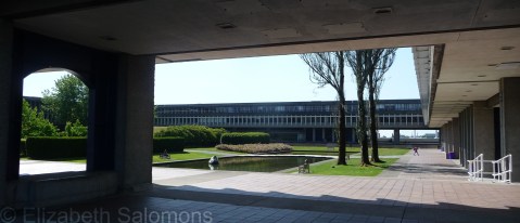
UBC is fond of combining architectural styles when it builds additions to existing buildings. The Main Library, another of the three buildings constructed in 1925, morphed into the Irving K. Barber Learning Centre in 2008. The neo-Gothic centre is the original building, now surrounded by a postmodern glass structure.
Here’s a look at it from another angle.

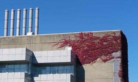
Four wings were added to the Chemistry Building between 1959 and 1989. This is a corner of one of those wings, built in the Brutalist style.
And this postmodern structure is an addition to the Henry Angus Building, which houses the Sauder School of Business. The addition, which opened in 2012, is wrapped around the original building, which was built in 1965 and expanded in 1976.

With 50,000 students, UBC is Canada’s fourth largest university and the largest in Western Canada. These days, the Point Grey campus is one massive construction site. In the past year, work was completed on a new trolley bus loop, upgrades to primary pedestrian corridors (which for some reason I have yet to figure out are called “malls” here), and a new fountain in Martha Piper Plaza. Building construction currently underway includes a new Student Union Building, the new Centre for Brain Health at UBC Hospital, and expansion of the UBC Bookstore. A new building that will house the Faculty of Education is scheduled to break ground this winter.
UBC’s Class of 2016 fittingly calls itself the Class of Construction.
Simon Fraser University
And now, for something completely different.

Unlike the universities I wrote about in the previous four posts, whose campuses are all situated smack in the middle of a city, Simon Fraser University sits above the city, on top of a mountain. (Which, in my humble opinion, takes the notion of an Ivory Tower a tad too literally.)
Construction of SFU’s Burnaby campus was begun in the spring of 1964, and the university welcomed its first 2500 students in September 1965.

The architects were Arthur Erickson ― probably Vancouver’s best-known and most influential architect ― and Geoffrey Massey. The campus atop Burnaby Mountain is in the Brutalist style of architecture, and won the 2007 Prix du XXe siècle from the Royal Architectural Institute of Canada, which recognizes buildings of significance to Canada’s architectural history.
University of Toronto
Next up on my tour of schools I’ve photographed: the University of Toronto. I was a student here myself a long time ago, just for a year, and to this day I consider it the prettiest of all the schools I’ve attended (and there’ve been a few).
When I commented to my sister on the architectural style of the buildings at Johns Hopkins, she asked me what the buildings at U of T looked like.
“They’re neo-Gothic,” I said. Also called Gothic Revival, you see neo-Gothic buildings all over Canada ― our Parliament Buildings in Ottawa are probably the best-known example.
The University of Toronto has been around since 1827, has a dozen colleges on three campuses, and is the largest university in Canada with an enrollment of 75,000 students. I took these photos of the St. George campus when I was in Toronto exactly a year ago this week.


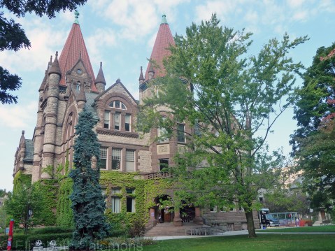
Not all of the buildings on the St. George campus are neo-Gothic. The main building of Victoria University, shown below, is called Richardsonian Romanesque, after its architect, Henry Hobson Richardson.
Trinity College is in the Jacobethan style.

And this monstrosity, Robarts Library, was built in the 1970s in what is known as Brutalist Architecture. Appropriate name for the look, I should think. It’s not-so-affectionately known as “the Turkey” by the students of U of T; I’m sure you can figure out why.

Through My Lens: Chihuly in Vancouver
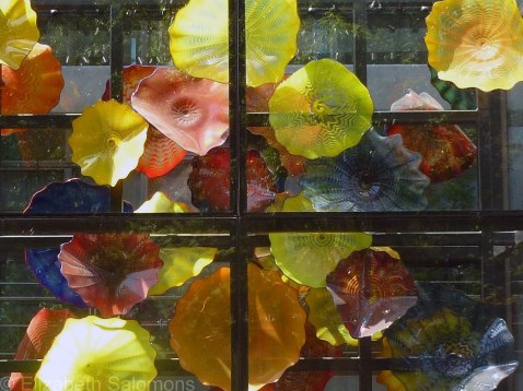
Remember Chihuly in Seattle? After I got back from my two days in Seattle, I was telling a friend here in Vancouver about Chihuly’s remarkable art work. And that friend then informed me one of Chihuly’s glass works is permanently on display at Bute and Alberni.
“Bute and Alberni?” I looked at him, puzzled. “I used to work at Bute and Alberni. Where ―?”
And then the penny dropped. The glass flowers in the glass box! I would stare at them from my seventh-floor office window whenever I was stuck editing a page, a paragraph, a sentence, … basically anything with words in it. It happened ― a lot.
This photo isn’t the best because, well, there was this massive, not very clean, glass box between my camera lens and the art work. But, there you have it, Vancouver readers. Know that we have our very own Chihuly glass work.
Through My Lens: Sails

Last week, I posted a photo of the giant pillows made from the sails at Canada Place. I took this photo — of those same sails when they were still hanging in their original home — back in 2009.
Through My Lens: Lunch Break

Last summer, these delightful giant pillows lay on Robson Street, directly in front of the Vancouver Art Gallery. This summer, they found a new home in front of UBC’s Koerner Library. They’re called Pop Rocks. Their fabric was recycled from the old sails at Canada Place (which were replaced in 2010), and they were stitched together by a local sail maker.
I wonder how many lunch-time naps they’ve witnessed?
Art Talk: Grand Hotel

Yup, it’s another post about hotels, but this time I’m not recommending a place to stay. This post is about yet another art exhibition ― one that I stumbled upon when I was at the Vancouver Art Gallery to see Persuasive Visions.
The exhibition takes its name from the 1932 film Grand Hotel, winner of that year’s Oscar for Best Picture. One of the characters in the film keeps muttering, “Grand Hotel … always the same. People come, people go. Nothing ever happens.”
Huh. Yeah, right.
Grand Hotel: Redesigning Modern Life, seemingly an exhibition more appropriate for a museum than an art gallery, looks at the history of the hotel through the lens of four themes: travel, design, social, and culture. Displays include scale models of some of the world’s most architecturally impressive hotels, such as New York’s Waldorf Astoria and Singapore’s Marina Bay Sands. There are photos and memorabilia about the development of Canada’s tourist industry, thanks to the Canadian Pacific railway hotels (“If we can’t export the scenery, we’ll import the tourists”), and the development of the same in the United States, courtesy of Highway 66 and motor hotels. Did you know the InterContinental luxury hotel chain was founded by Pan Am? I didn’t.
The exhibition also looks at hotels as agents of change concerning race, class, and gender. The Algonquin Hotel in New York, host to the 1920s writers group known as the Algonquin Round Table, was one of the first hotels to accept solo female guests. Duke Ellington was known to prefer touring overseas because hotels outside of the United States weren’t segregated.
And, finally, hotels are explored as centres of culture: the aforementioned Algonquin Hotel in New York, gathering place of New York’s literati, the Chateau Marmont, home to film stars during Hollywood’s Golden Age, and Hotel Imperial Vienna, focal point of Vienna’s coffeehouse culture.
Grand Hotel: Redesigning Modern Life will appeal to anyone interested in travel, and is on display at the Vancouver Art Gallery until September 15.

Through My Lens: Pride in Davie Village
Davie Village has been adorned the past few weeks with more rainbow flags than usual. They’re in celebration of Pride Week, which culminates every summer on the Sunday of the August long weekend, when Western Canada’s largest Pride Parade takes place.
The most spectacular rainbow flag I’ve seen this summer is this one, at the intersection of Davie and Bute. It’s permanent, and a cheerful addition to the neighbourhood.

Sunny July
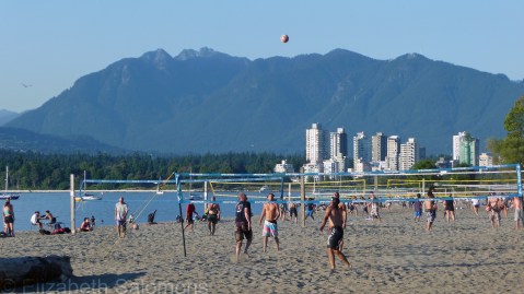
Only in Vancouver would 34 consecutive days of sunshine make the day’s biggest news story. But that’s what happened yesterday. Vancouver received 411 hours of sunshine in July, and it was the first calendar month ever (since Environment Canada started tracking weather data) where we didn’t get a drop of the wet stuff.
Today, the weather’s back to normal: grey skies and the threat of rain. Despite the cooling temperatures, a campfire ban covering almost the entire province went into effect yesterday. I don’t remember there being campfire bans when I was growing up in (sunny) Alberta, but, ironically, now that I live in a rainforest, they are routine.
